






Perumda Parkir Makassar Ikut Coaching Dashboard QRIS di BI
- calendar_month Rabu, 22 Okt 2025

info Atur ukuran teks artikel ini untuk mendapatkan pengalaman membaca terbaik.
Makassartoday.com, Makassar – Upaya Pemerintah Kota Makassar menuju kota pintar (Smart City) kembali diperkuat melalui inovasi digital di sektor perparkiran.
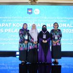
Jajaran Direksi bersama Staf Operator Perumda Parkir Makassar Raya menghadiri kegiatan Coaching Dashboard QRIS yang digelar oleh Bank Indonesia (BI) di Kantor Perwakilan BI Provinsi Sulawesi Selatan, Selasa (21/10/2025).
Kegiatan tersebut menjadi langkah penting dalam memperluas implementasi sistem pembayaran non-tunai melalui QRIS (Quick Response Code Indonesian Standard) pada layanan parkir di Kota Makassar.
Direktur Utama Perumda Parkir Makassar Raya, Adi Rasyid Ali, menyampaikan apresiasi atas dukungan BI dalam memperkuat sistem pembayaran digital yang lebih efisien dan transparan.
“Kami menyambut baik kegiatan ini sebagai bagian dari upaya mewujudkan sistem pelayanan parkir yang modern dan akuntabel. Melalui integrasi QRIS, kami berharap seluruh transaksi parkir berlangsung lebih cepat, aman, dan efisien,” ujar ARA, sapaan akrabnya.
Lebih jauh, ARA menegaskan bahwa penerapan sistem digitalisasi parkir merupakan bagian dari strategi besar untuk menghadirkan tata kelola perparkiran yang profesional dan berintegritas.
Menurutnya, transformasi digital tidak hanya meningkatkan pelayanan publik, tetapi juga menjadi instrumen penting dalam mencegah potensi kebocoran pendapatan daerah.
“Digitalisasi ini bukan sekadar inovasi teknologi, tetapi bentuk komitmen kami untuk meningkatkan pelayanan dan memperkuat transparansi pengelolaan pendapatan parkir,” tambahnya.
Bank Indonesia sendiri terus mendorong adopsi QRIS di berbagai sektor layanan publik.
Melalui sistem ini, masyarakat dapat menikmati kemudahan bertransaksi tanpa uang tunai (cashless), sekaligus memperluas ekosistem ekonomi digital di daerah.
Implementasi QRIS di sektor perparkiran dinilai menjadi salah satu langkah konkret untuk mendukung visi Makassar Smart City yang berorientasi pada efisiensi layanan publik dan integrasi teknologi digital.
Dengan kolaborasi antara BI dan Perumda Parkir Makassar Raya, diharapkan sistem parkir di Kota Makassar tidak hanya semakin modern, tetapi juga mampu meningkatkan Pendapatan Asli Daerah (PAD) secara berkelanjutan.
(**)

forum Komentar (10)
Artikel Terkait
-
Sitti Husniah Talenrang Tersangka, Gubernur Sulsel: Wakil Bupati Bakal Isi Posisi Bupati Gowa
- calendar_month Sabtu, 26 Sep 2026
- 0Komentar
Makassartoday.com, Makassar — Gubernur Sulawesi Selatan, Andi Sudirman Sulaiman, memastikan roda pemerintahan dan pelayanan publik di Kabupaten Gowa tetap berjalan normal pasca-penetapan Bupati Gowa, Sitti Husniah Talenrang, sebagai tersangka oleh Korps Pemberantasan Tindak Pidana Korupsi (Kortastipidkor) Polri. Andi Sudirman menegaskan bahwa penanganan kasus hukum merupakan wewenang penuh aparat penegak hukum. Namun, dari sisi birokrasi, mekanisme […]
-
Rotasi Jabatan di Polda Sulsel: Lima Kapolres Resmi Berganti, Ini Daftar Lengkapnya!
- calendar_month Kamis, 24 Sep 2026
- 0Komentar
Makassartoday.com, Makassar – Kapolda Sulawesi Selatan, Irjen Pol. Djuhandhani Rahardjo Puro, memimpin upacara serah terima jabatan (sertijab) lima Kapolres di jajaran Polda Sulsel. Kegiatan ini berlangsung di Lapangan Apel Mapolda Sulsel pada Kamis (24/9/2026). Adapun lima posisi kepemimpinan yang berganti yakni Kapolres Tana Toraja, Kapolres Pelabuhan Makassar, Kapolres Barru, Kapolres Luwu Utara, dan Kapolres Luwu […]
-
Sempat jadi Sorotan, Kompleks TNI Jalan Mawas Kini Bebas Jukir Liar
- calendar_month Rabu, 23 Sep 2026
- 0Komentar
Makassartoday.com, Makassar — Kawasan kompleks TNI di Jalan Mawas, Kecamatan Mamajang, Kota Makassar, kini dipastikan bersih dan steril dari aktivitas parkir liar, Rabu (23/9/2026). Penertiban total ini dilakukan menyusul insiden penganiayaan dan penikaman oleh oknum juru parkir (jukir) liar terhadap seorang pengemudi ojek online (ojol) di lokasi tersebut. Peristiwa kekerasan yang sempat memicu keresahan publik […]
-
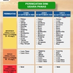
Waspada Cuaca Menyengat di Sulsel 24–26 September 2026, Sejumlah Daerah Masuk Status Siaga!
- calendar_month Rabu, 23 Sep 2026
- 0Komentar
Makassartoday.com, Makassar — Balai Besar Meteorologi, Klimatologi, dan Geofisika (BBMKG) Wilayah IV mengeluarkan peringatan dini terkait potensi cuaca panas ekstrem atau feels like yang akan menerpa sejumlah kabupaten dan kota di Sulawesi Selatan (Sulsel) selama tiga hari ke depan, mulai Kamis, 24 September hingga Sabtu, 26 September 2026. Berdasarkan prakiraan BMKG, suhu udara yang dirasakan […]

I have booked my first proper color appointment, and I am trying to arrive with a useful description instead of a heavily edited photo. The hair I have now is a fairly ordinary brown and my skin is fair, so I am considering a cooler change rather than a bright copper or golden blonde. Most of the examples I saved were photographed in very flattering light. I cannot tell which of those shades would still look balanced when I am outside or under office lighting. I would like to compare two nearby shades. I would prefer a result that can grow out without urgent touch-ups. I am using cool summer hair color ideas as vocabulary for the consultation, not as a strict rule about what I should choose. Would it help to compare sample swatches against my face? I can take pictures in natural light, but I am unsure how much to trust a phone camera’s color balance. The appointment includes a shorter cut, so I would rather make the color decision thoughtfully than change everything at once. A small test seems easier to evaluate than a dramatic leap. What simple comparison helped you reject a shade that only looked good in a photo? I am especially interested in how you weighed everyday lighting, upkeep and the condition of your own hair.
29 September 2026 9:55 amI’m thinking about changing my hair color, but I want to understand my undertone first. My phone photos look quite different depending on the room. In daylight my skin looks fairly neutral, while the bathroom light makes it look much warmer. I realize the phone may change the white balance. I don’t want to pick a hair shade based on one misleading picture. Would you photograph the same face in steady natural light? I’m also unsure whether to compare my face with a white shirt, a gray background, or several fabric colors. I have tried the vein check, although the result is unclear. I found this page while looking into skin undertone test camera and plan to use it as a starting point for comparing colors rather than treating one result as a verdict. If you’ve tested this yourself, what setup gave you the most consistent photos? I can keep my clothing the same across photos. That would give me a more consistent comparison. I’d especially appreciate advice from anyone who checked their palette before making a hair appointment. I have time to try a more careful comparison before I book.
27 September 2026 10:04 pmI make short generated instrumental sketches at home, and I would like to share one publicly after a sensible final review. The melody and pacing feel finished enough but the export has occasional sandy texture around cymbal-like sounds It is subtle on speakers but clearer in a quiet room I only want to avoid sharing something that distracts from the music I am keeping the original export safely unchanged Afterward I would use a short A and B comparison at the same volume I would rather leave a small quirk than create a duller result remove suno artifacts points toward a focused review instead of an endless editing session I could send both versions to one trusted listener for a simple impression How do you keep a quick cleanup from becoming an attempt to rewrite the whole track? Practical experiences from home producers would be especially helpful, particularly routines that fit a quiet evening without specialist equipment.
26 September 2026 7:17 pmI am planning a capsule wardrobe and want to confirm my season before choosing the main colors. A few simple assessments indicate autumn although the exact subtype changes. Soft brown and moss are dependable but mustard and strong rust can make my complexion look uneven. Since I want a streamlined wardrobe each neutral and accent needs to combine easily with the others. autumn seasonal palette gives me a starting list to compare but I would like to validate the direction with actual fabric. My draft test set includes cream, warm navy, chocolate, olive, muted teal, and brick. I can take consistent pictures in indirect daylight using the same camera settings. For the core wardrobe shades should I focus more on skin clarity or on harmony with my hair and eyes? I also need two accents that can work across casual and slightly formal outfits. Soft petrol blue looks encouraging while brick red may be easier than orange. Does this set separate autumn clearly or should I add a cooler control color for comparison? A focused testing routine would help me avoid buying colors based only on a label. My focus is a wearable result rather than following every suggested autumn shade. Please share any useful comparisons
25 September 2026 3:48 pmI am trying to choose between Soft Winter and Deep Winter before replacing a few wardrobe basics. Many quick seasonal guides make both directions seem reasonable when I look at them separately. Although my hair is quite dark, I do not want to assume that the deepest colours are automatically best. In neutral morning light some berry shades look clear while others make my face seem flatter. I keep testing charcoal, navy, and softer grey fabrics rather than relying on one dramatic colour. A friend suggested plain photos and the same lighting so that the comparison stays fair. I will also compare the fabrics at the same time of day. I am using this as a neutral reference: color analysis This way I can compare candidates without rushing into a label. How do you separate these two palettes when neither result feels completely clear?
24 September 2026 7:28 pmI am planning a capsule wardrobe and want to confirm my season before choosing the main colors. A few simple assessments indicate autumn although the exact subtype changes. Earthy taupe and olive are reliable but mustard and strong rust can make my complexion look uneven. Since I am keeping the wardrobe compact each neutral and accent needs to combine easily with the others. autumn seasonal palette provides a framework for the first round but I would like to validate the direction with actual fabric. I am considering a comparison of cream, warm navy, chocolate, olive, muted teal, and brick. I will record each fabric test in indirect daylight using the same camera settings. When evaluating base colors should I focus more on skin clarity or on harmony with my hair and eyes? I would like two flexible accent colors that can work across casual and slightly formal outfits. A subdued turquoise may work while brick red may be easier than orange. Is this range useful for checking autumn or should I add a cooler control color for comparison? A small set of decisive checks would help me avoid buying colors based only on a label. My focus is a wearable result rather than following every suggested autumn shade. Any capsule wardrobe experience is welcome
22 September 2026 11:05 amHola a todos, estoy planeando un viaje a Tenerife y me gustaria probar jetski durante mi estancia. He investigado sobre los dos lugares mas populares para esta actividad: Los Gigantes y Playa de las Americas. Por lo que he visto, Los Gigantes tiene unos acantilados increibles que creo que brindarian un entorno precioso mientras estas sobre el agua, pero he leido que puede ser un poco mas desafiante para alguien con nivel intermedio, especialmente con el oleaje y las corrientes que representan un reto considerable. Por otro lado, Playa de las Americas se presenta como una alternativa mas calmada, ideal para pasarlo bien sin complicaciones, aunque el entorno no resulta tan llamativo. Para alguien que aprecia tanto el entorno como la comodidad del recorrido, ?cual recomendarian? He encontrado un post con fotos y contenido visual que aclara bastante la eleccion motos de agua radazul precio , pero agradeceria mucho leer testimonios directos de quienes hayan probado jetski en ambos sitios. ?Cual creen que tiene mayor encanto para alguien como yo que busca algo intermedio y paisajes bonitos? Les agradezco de antemano sus opiniones.
13 September 2026 1:16 amI am preparing a small set of Suno stems for a community project, and the last export left faint clicks and metallic tails between phrases. The tracks are usable, yet those details become distracting on headphones. I do not need a dramatic remake; I want careful cleanup that preserves timing and the character of the vocals. While comparing practical options, I found a brief repair guide. It gave me a starting point, but I would value advice from people who have tested similar tools. I am trying to decide whether selective repair belongs before or after a light EQ pass. My practical concern is retaining human vocal detail. A separate test render seems sensible. I can compare a few sections without changing the whole track. The repair should remain measured. Any processed layer must align properly with the original. I also need simple settings for later revisions. A modest listening session may reveal more than meters alone. The final mix should still feel natural. The chosen steps must be clear to document. I will also listen at moderate volume. I would rather leave a minor flaw than create a new one. Has anyone found a dependable order for this kind of careful repair? I would appreciate practical notes.
13 September 2026 1:01 amTengo una tarde libre entre una caminata y una cena, y dudo entre una ruta guiada en moto de agua o un alquiler corto. La opcion larga parece interesante, pero no quiero que las esperas y los traslados ocupen la tarde. Necesito una decision practica y un margen comodo antes de mi siguiente plan. He visto opciones desde Costa Adeje. Para comparar tiempos abri esta lista de ideas para moto de agua. Quiero saber cuanto dura todo desde la llegada hasta el regreso. El horario debe ser claro. El punto de reunion tiene que ser cercano. La espera inicial deberia ser clara. La explicacion debe ser ordenada. El recorrido tiene que ser bonito. El grupo deberia ir unido. El mar debe estar favorable. El traslado final debe ser puntual. El margen antes de cenar debe ser prudente. La reserva ha de ser simple. La informacion final debe ser breve. La ruta debe dejar una sensacion segura. El regreso debe sentirse comodo. ?Cuanto margen dejaron ustedes antes de otro plan? ?Las vistas compensaron la menor flexibilidad? Gracias por estimaciones honestas.
7 September 2026 6:24 pmSi deseas quieres saber donde conseguir jetskis en esta isla, hay muchas opciones fantasticas tanto en el zona sur como en diversas zonas como la Costa Adeje y este animado lugar. Es posible localizar alquiler moto de agua Tenerife sur con valores razonables y aventuras como jet bike safari o aqua safari que unen adrenalina pura y entornos maravillosos. Para propuestas mas concretas, tambien hay la posibilidad de rentar motos de agua en Tenerife Los Gigantes o gozar actividades acuaticas en este enclave. Para mas informacion sobre disponibilidad y valores, te recomiendo visitar imagenes .
Ademas, Tenerife ofrece alternativas para cualquier nivel, desde principiantes hasta avanzados, con negocios como Jet Hub Tenerife y Adrenalina Jet que coordinan recorridos en jets de agua y jet ski safaris en lugares como Costa Adeje. Si quieres una aventura integral y tranquila, ten en cuenta las excursiones motos de agua Tenerife sur o en otros lugares, y no descuides que contratar con anticipacion siempre ayuda, sobre todo en epoca alta. Por si lo deseas, el telefono +34 612 345 678 puede ser conveniente para resolver dudas.
25 Juni 2026 4:56 am